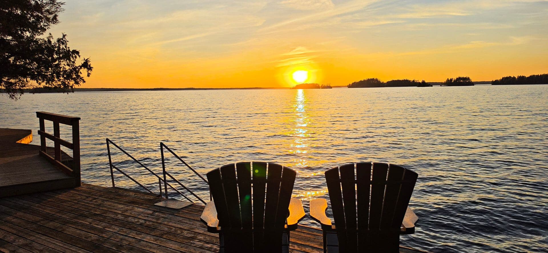
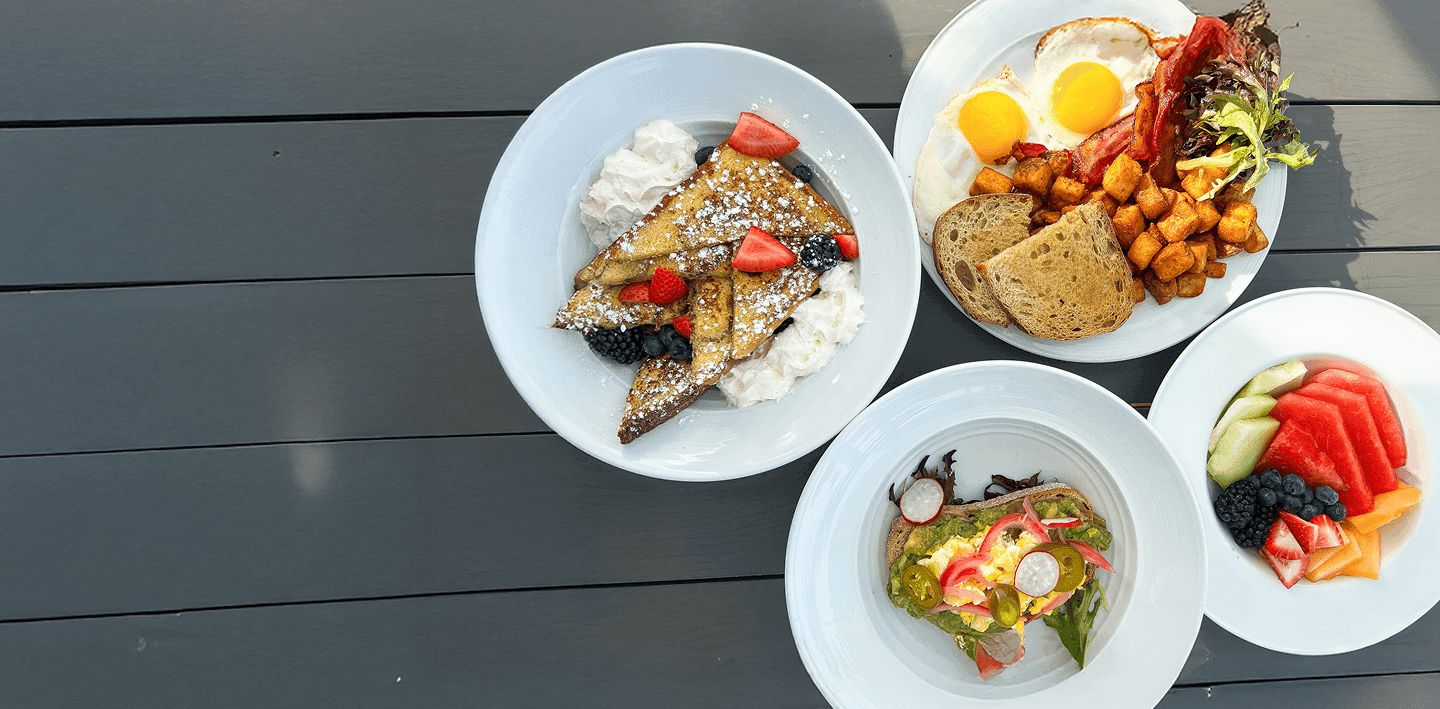
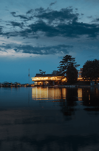
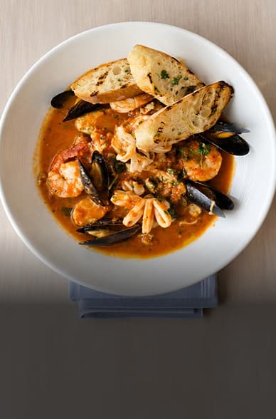



Attraction One
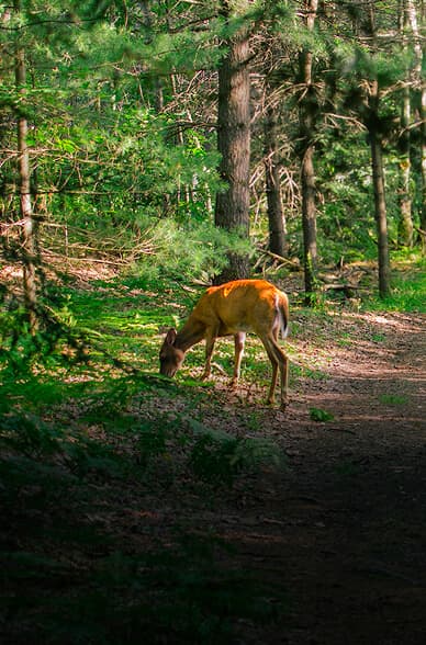
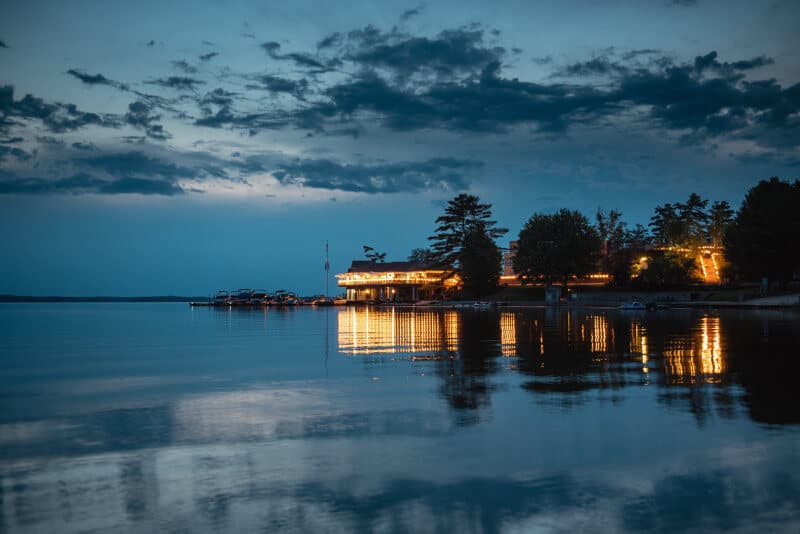
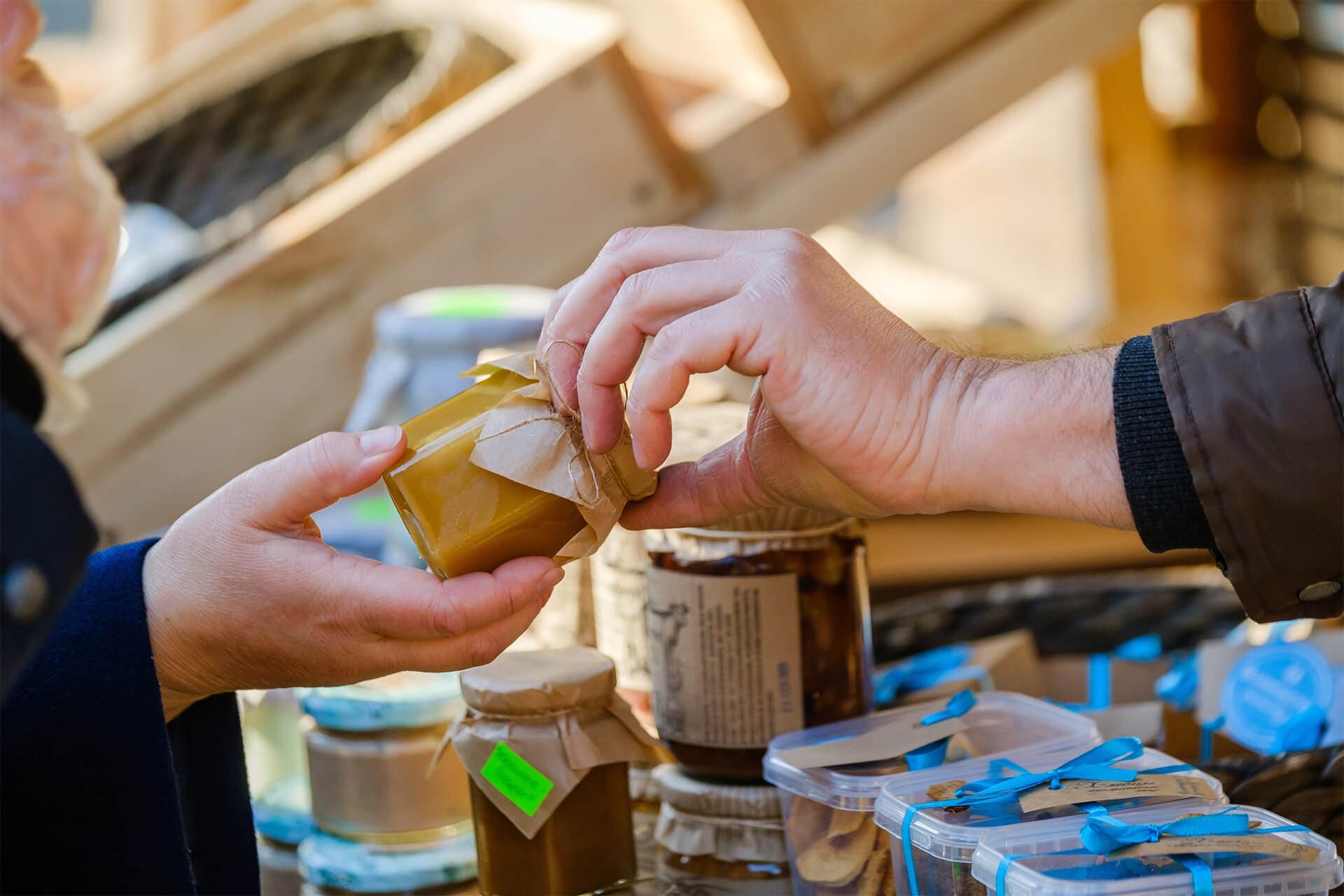
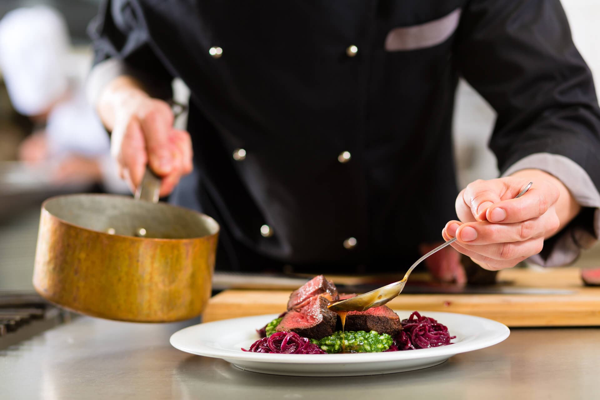
Each attraction card has an image, title, description, and an optional time/duration label.
90 minutes

1209 Muskoka Beach Road,
Gravenhurst, Ontario, Canada
P1P 1R1
This is the subpage hero component used for interior pages. It supports a desktop image, a mobile image, a description, and an optional CTA button.

A simple page header used on policy and utility pages. Supports a title and an HTML description paragraph.
A grid of cards linking to key sections of the site. Each card has a title, description, image, and link.
Each featureBlock alternates image left/right. Supports an optional top-level CTA button and an optional direction_reverse flag to start flipped.
A feature block with an image on the right. Supports a title, subtitle, description (HTML), image, and an optional array of CTA buttons.
The second feature block flips the image to the left. This alternation continues for as many blocks as are defined.
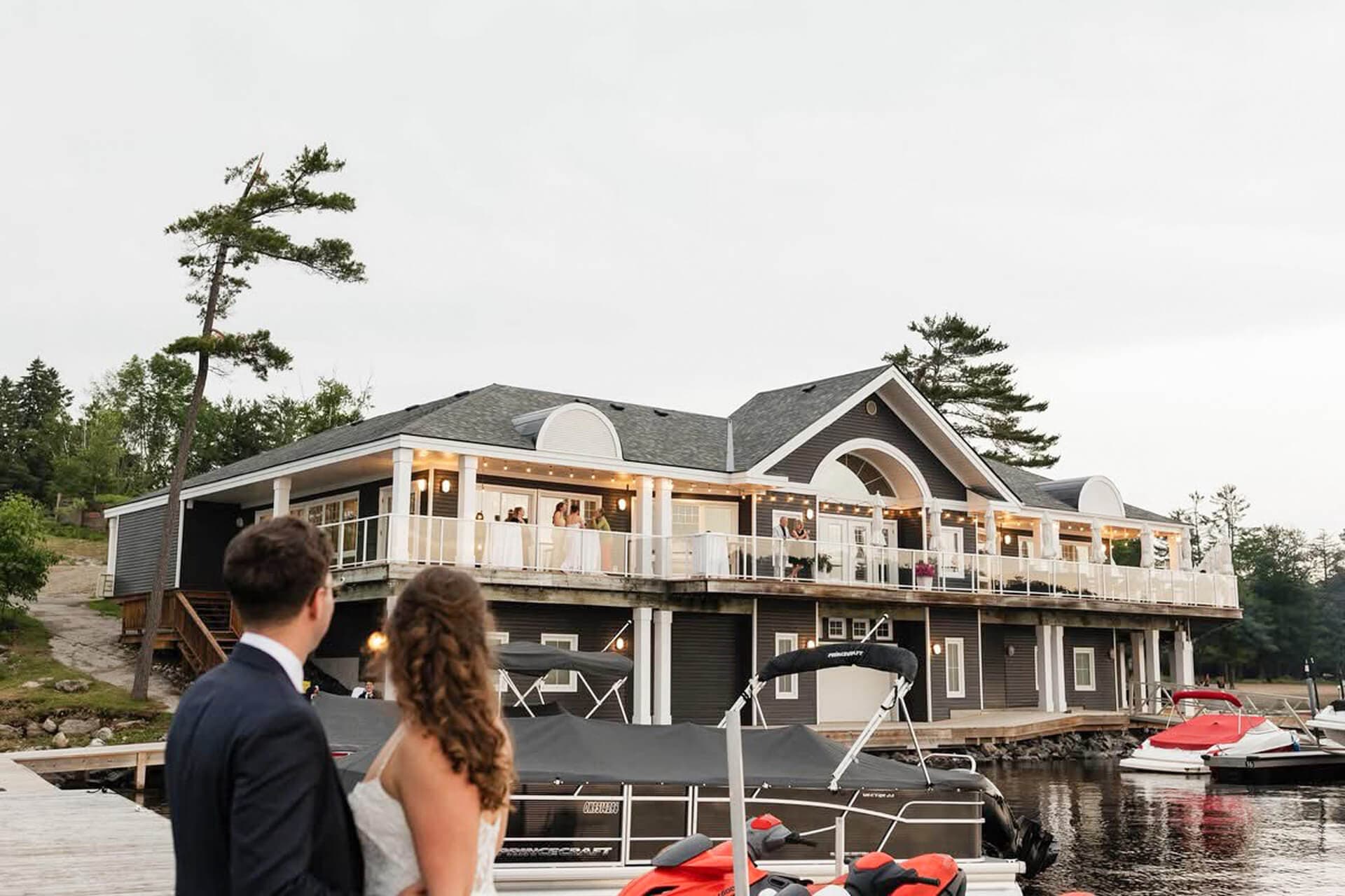
A grid of image/title cards, used for things like enhancement categories. Supports an optional top-level CTA button.


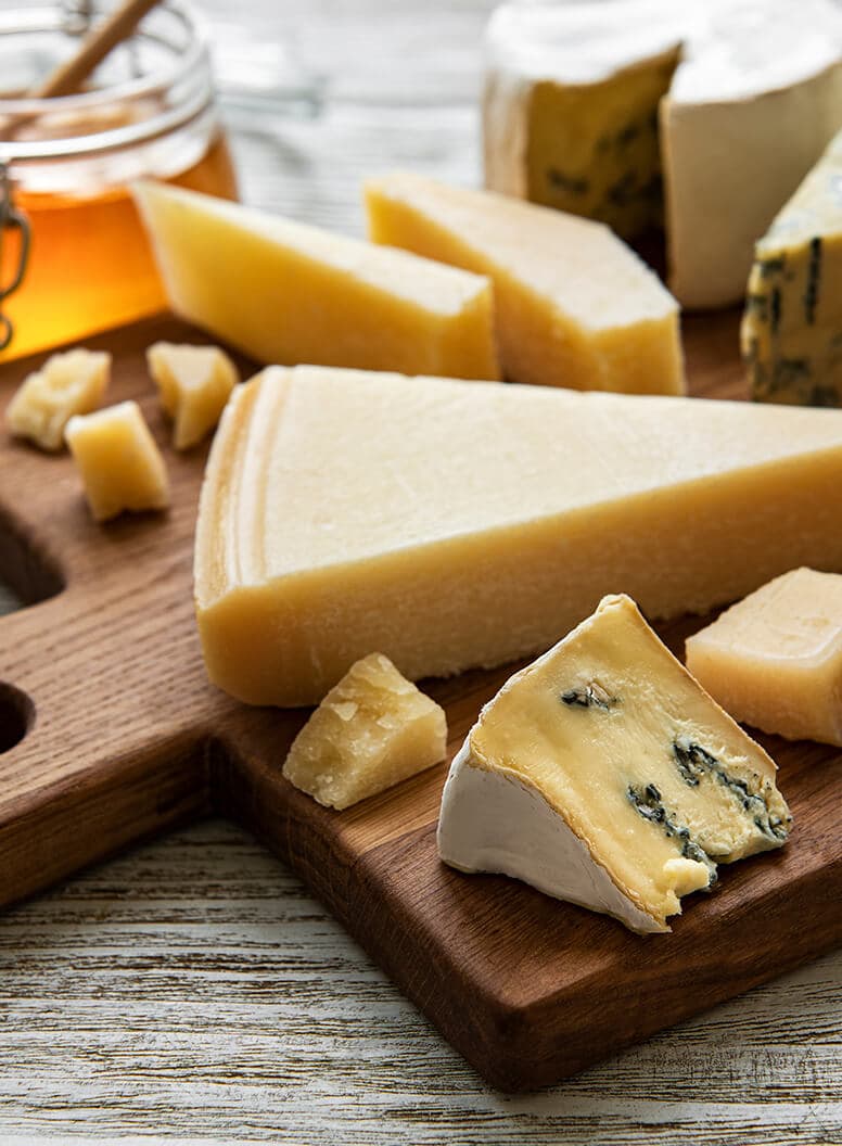

A slider of cards with image, title, and HTML description. Used for things like weekly drink specials. No background image, no tags.
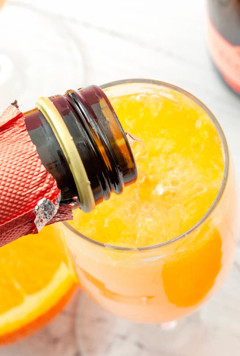

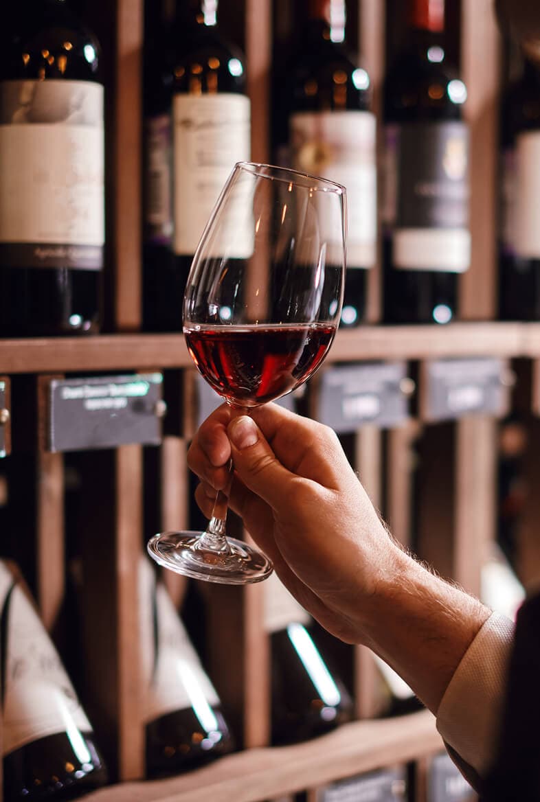
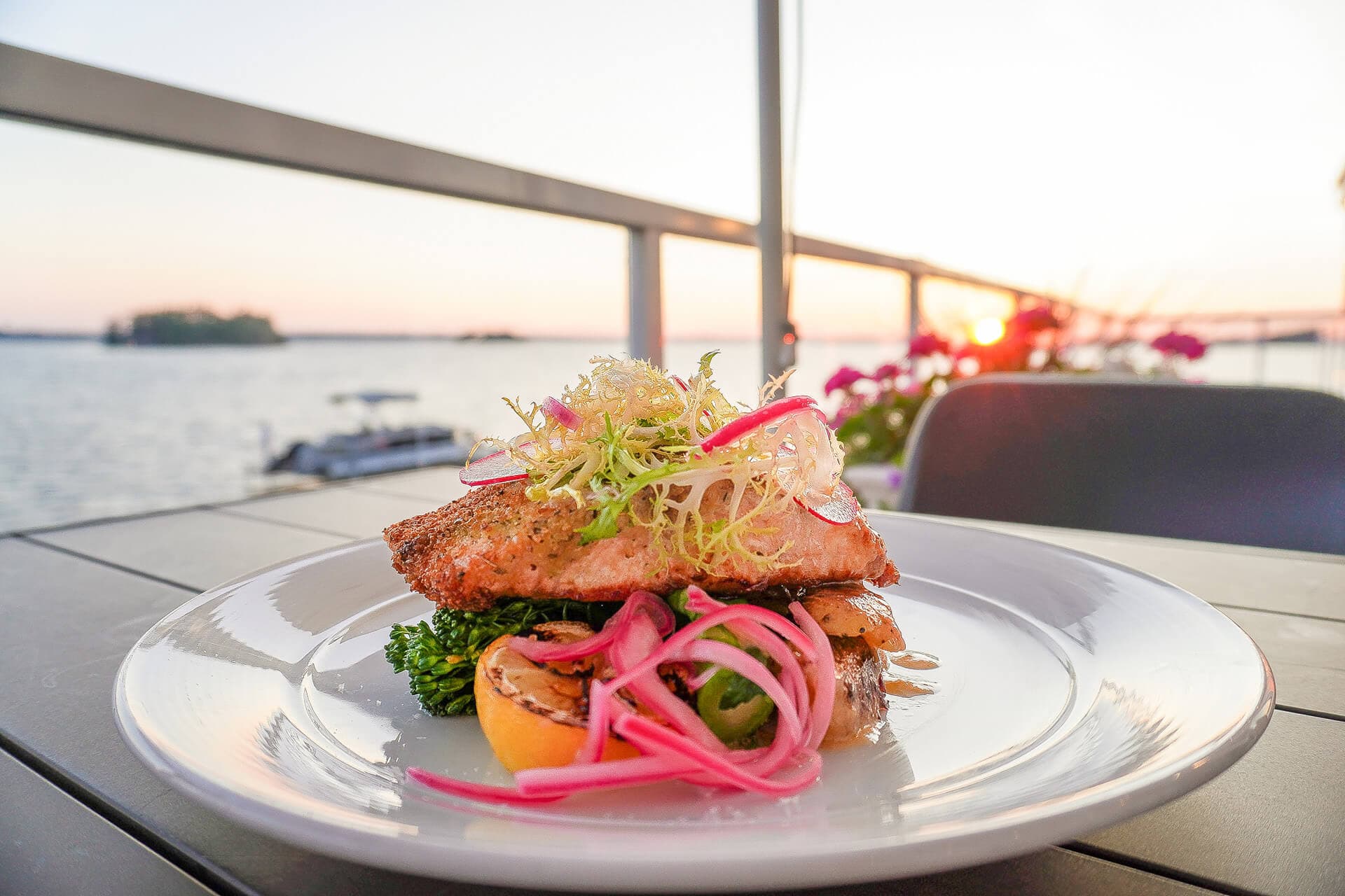
Post snippet featureBlocks each have a title, subtitle, description, image, and an array of CTA buttons.
A second snippet block. When style is 'solid' the component renders with a filled background.

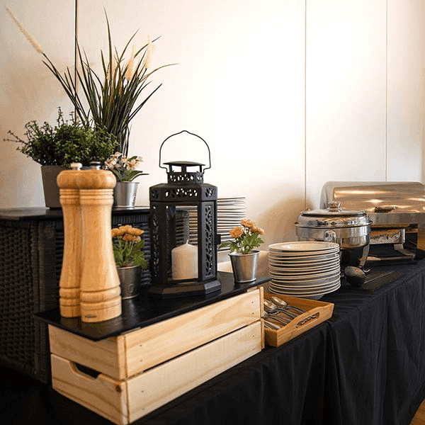
A three-column grid of image-backed highlight blocks. Each has a title, description, and a full-bleed background image.
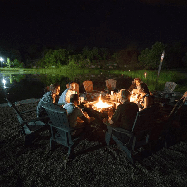
The second column of the highlight grid.

The third column of the highlight grid.
A text block paired with a set of overlapping images that scroll at different rates. Supports a title, subtitle, description, and an array of images with src, alt, width, and height.


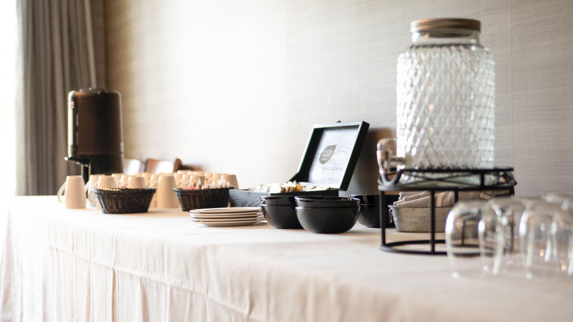
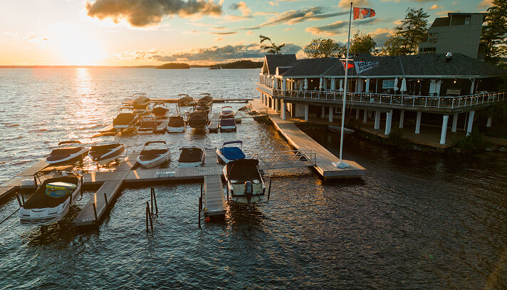
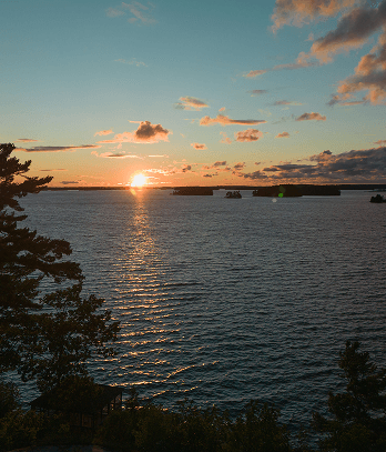
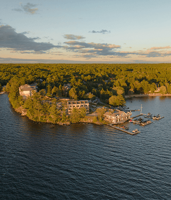
A grid of service or attraction cards. Each has an image, title, description, and optional time. Supports a top-level CTA button and an optional disclaimer.
Optional disclaimer text rendered below the grid, supporting inline links.
Each attraction card has an image, title, description, and an optional time/duration label.
90 minutes

A second attraction card. The time field is optional.
60 minutes

An attraction card without a time label.

A testimonials slider with a quote, attribution name, and optional section heading label displayed above each slide.~ Guest Name One
An accordion with grouped sections. Each group has a title and an array of items with a title and HTML description.
A second item in the same group, collapsed by default.
Groups create visual separation between unrelated sets of questions or topics.
CONTACT US
1209 Muskoka Beach Road
Gravenhurst, ON, P1P 1R1
Embeds a HubSpot form by portalId and formId. The optional id field creates an anchor for deep-linking to this section.
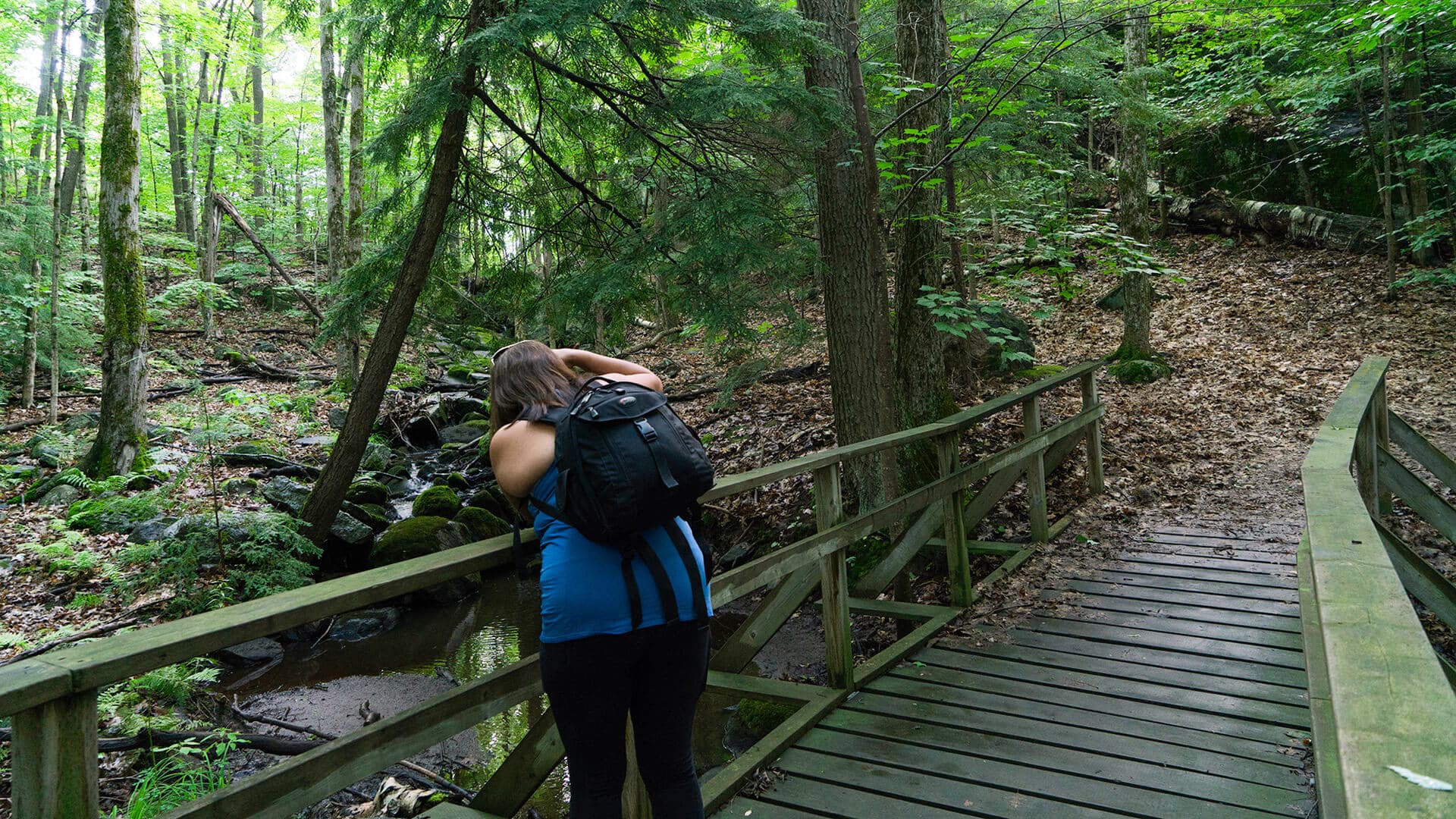
A full-width rich text block for long-form content such as policy pages. Accepts arbitrary HTML including headings, paragraphs, lists, and inline links.
Inline links and bold text are also supported.
A full-width call-to-action band. buttonType 'booking' opens the booking widget.
buttonType 'mailchimp' opens the newsletter sign-up modal.
buttonType 'link' navigates to the URL in the link field. The optional target field accepts '_blank' to open in a new tab.